


Build your Component Library - shadcn/ui
(2025-08-17T21:20.775Z)
Perplexity Query
(2025-08-17T21:20
.775Z)
Question:
What is ShadCN and why do developers love it so much?
Response from sonar-pro:
ShadCN is a modern, developer-centered UI component toolkit for React that allows you to build highly customizable, accessible, and performant web interfaces—quickly and with full control over your code. Developers love ShadCN because it blends flexibility, usability, and customization without the heavy trade-offs of traditional UI libraries.
[27dnkt]
[mrr328]
[c94ae2]
[rgkj29]
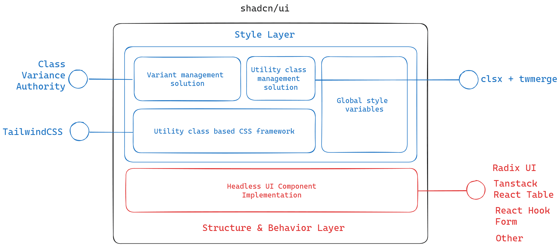
What is ShadCN?
- Modern foundation: All components use Tailwind for styling and are typed in TypeScript for better reliability and autocompletion. [rgkj29]

Conceptual diagram showing how ShadCN components plug into a React + Tailwind CSS workflow, emphasizing copy-paste and full control—highlighting composability, customization, and accessibility.
Why do developers love ShadCN?
- Smooth developer experience: Features like a CLI for scaffolded setup, compatibility with popular tools (Next.js, Vite), and support for dark mode add to its seamless integration and speed up projects. [v5ir7s]
- Modern ecosystem integration: ShadCN plays nicely with AI-powered tools (such as Vercel’s v0) to auto-generate and fine-tune UI code based on prompts, making rapid prototyping and iteration effortless. [v5ir7s]
Screenshot or illustration of a React app interface with a sidebar, several buttons, a modal, and a table—each labeled as ShadCN components, with Tailwind utility classes visible. Caption: "A modern dashboard built rapidly with ShadCN components, customized via Tailwind."
How it compares to traditional libraries
| ShadCN | Traditional UI Libraries (e.g., Material UI, Bootstrap) |
| Direct code copy/paste | Installed as npm dependency |
| Full source code ownership | Limited to what the library exposes |
| Tailwind CSS for styling | Often use CSS-in-JS, predefined themes, or less flexible CSS |
| Radix primitives for accessibility | Custom or library-specific accessibility |
| Pick only what you need | All components bundled, risk of code bloat |
| Rapid customization | Customization usually harder, more opinionated |
Flowchart or infographic showing workflow: "Design → Pick component from ShadCN docs → Copy code → Paste and style → Deploy," compared to longer configuration and customization steps for conventional libraries.
Summary of key reasons for popularity:
- Speed: Quickly scaffold and launch fully accessible, production-ready UIs.
- Control: Developers can deeply customize components without “fighting the framework.”
- Modern stack: Powered by widely loved tools—React, Tailwind CSS, Radix UI, TypeScript.
- Community trust: Created by and for the modern web-dev community, addressing pain points from legacy approaches. [rgkj29]
Developers choose ShadCN to skip boilerplate, retain code power, and ensure professional accessibility and design best practices from day one.
[27dnkt]
[mrr328]
[c94ae2]
[v5ir7s]
[rgkj29]
Citations
[27dnkt] 2025, Jul 26. What is ShadCN and Why it is Used. Published: 2025-07-23 | Updated: 2025-07-26
[mrr328] 2024, Dec 16. What is shadcn/ui? | Polipo Blog. Published: 2024-11-15 | Updated: 2024-12-16
[c94ae2] 2025, Jun 16. Shadcn UI: A Comprehensive Guide of Opensouce UI. Published: 2024-09-30 | Updated: 2025-06-16
[v5ir7s] 2025, Aug 17. Shadcn UI adoption guide: Overview, examples, and .... Published: 2024-05-10 | Updated: 2025-08-17
[rgkj29] 2025, Jun 15. What is Shadcn UI and why you should use it?. Published: 2024-09-28 | Updated: 2025-06-15